M4B
Self-checkouts of the Future
- Industry
- Retail / Self-checkout
- My role
- Experience Strategist / Design Consultant
- Year
- 2022
M4B Self-checkouts of the Future
Industry
Retail / Self-checkout
My role
Experience Strategist / Design Consultant
Year
2022
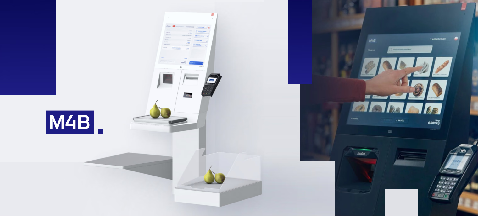
About the company
M4B S.A. is a leading provider of innovative digital signage and self-service solutions in Poland, dedicated to enhancing client engagement. They deliver platforms for KFC, Jeronimo Martins, and multiple retail chains.
Challenge
The goal was to design a self-checkout from the ground up, for a market with almost no accessible benchmarks — coupling a physical device with a digital flow that had to feel effortless even for people who aren’t comfortable with technology. Because the hardware constrains everything — sensors, and an update cycle that makes true agile iteration impossible — the experience has to be right from the first release, not patched later. As lead designer I drove it from research through design. Validation was the real story: an early cardboard rig with a taped-on iPad, a bike light standing in for the purchase LED and a webcam faking the camera monitoring — before the harder round of wiring test software into a real machine, fighting genuine hardware and network limits. It’s not a laptop, it’s a checkout.
PHASE 1: Product Discovery
Good practices and benchmarks from self checkouts available in 8 different chains of stores
Expert analysis of selected interfaces. Some of them were unique and inspiring, some showed us what to avoid.
Co-creation involved collaborating with end-users to align on mapping a user journey
PHASE 2: Building & validating a prototype
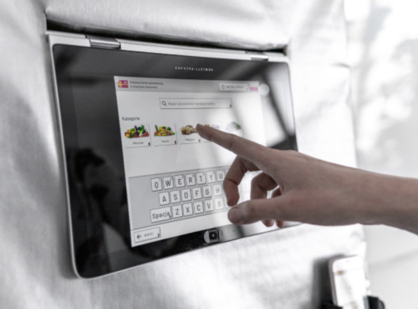
In the first stages of our prototype, we tested if people noticed that they could operate the device with their voice. We observed their attitudes and willingness to use this feature
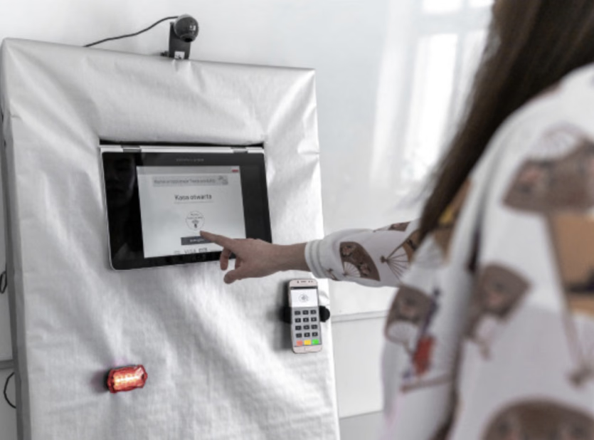
While our research indicated that talking self-checkouts cause stress and discomfort, the reactions are opposite when the roles are reversed
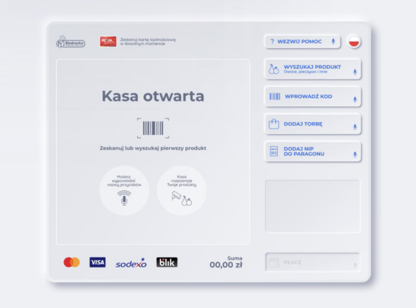
We made sure that users remained in full control of the interface. For example: if they don't want to find their grapes by speech, they can use keyboard, Al-driven seproduct scanner or select product from the complete list
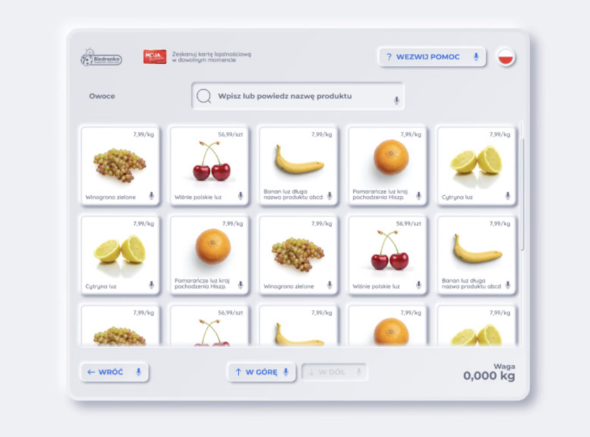
Al-recognized products show up in the bottom half of the search engine. You no longer need to remember if an avocado is a fruit or a vegetable!
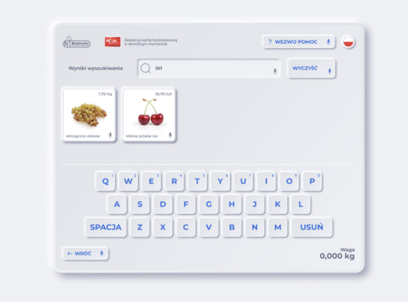
We made sure that users remained in full control of the interface. For example: if they don't want to find their grapes by speech, they can use keyboard
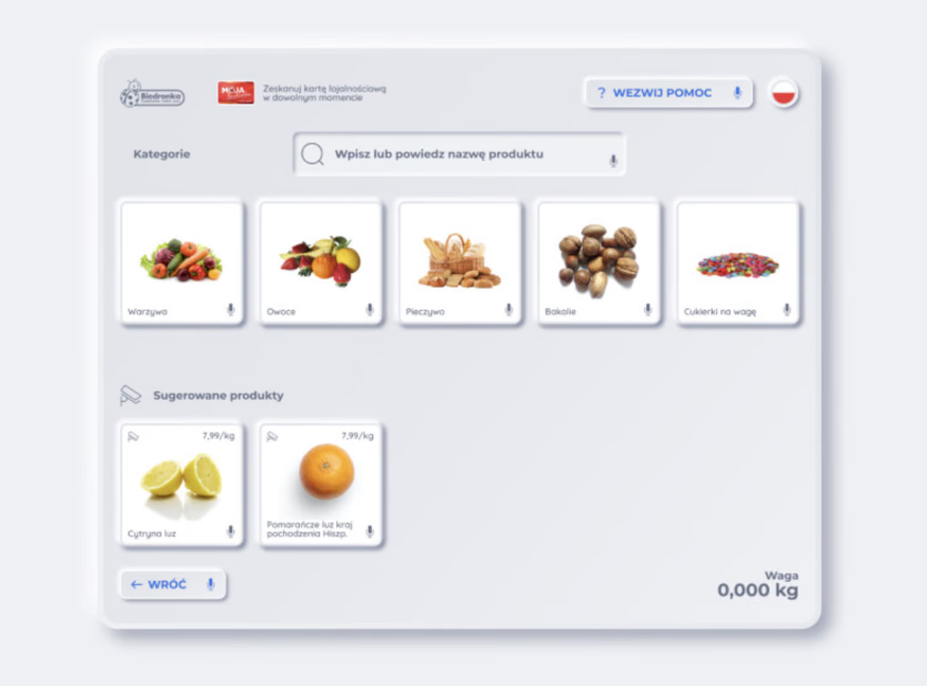
Al-recognized products show up in the bottom half of the search engine. You no longer need to remember if an avocado is a fruit or a vegetable!
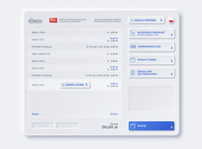
Most kiosks do not provide the option to change the amount of added items. Some hide it in a complex menu and expect users to enter the number before adding the product
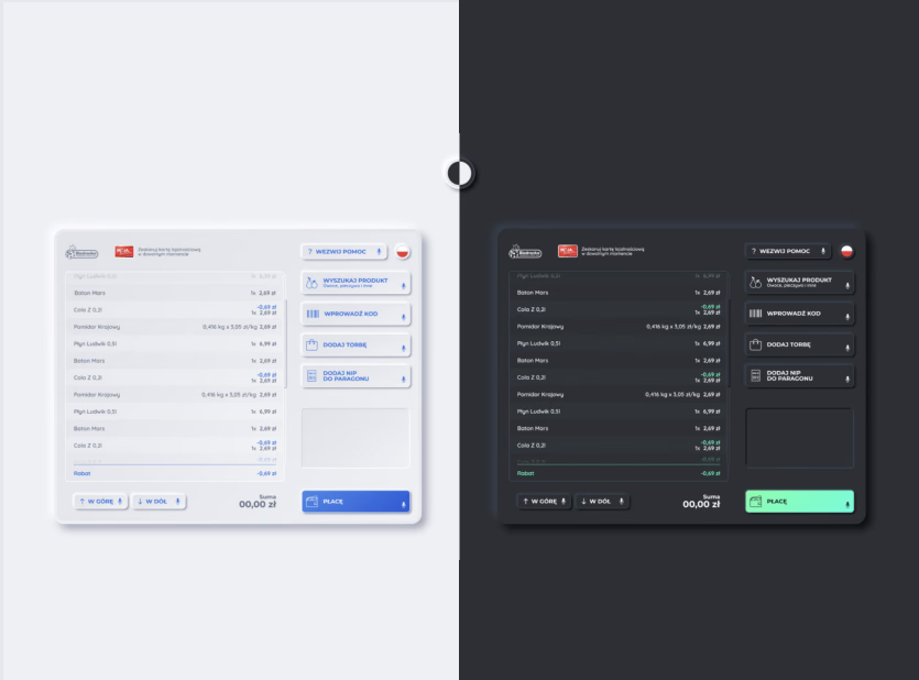
We created an intuitive interface with "a premium look" as our research participants suggested. Thanks to the research we performed, it turned out that the new features that are not yet available on the market, are easily understandable by all of our users
PHASE 3: Usability tests on the alpha build and last refinements before deployment
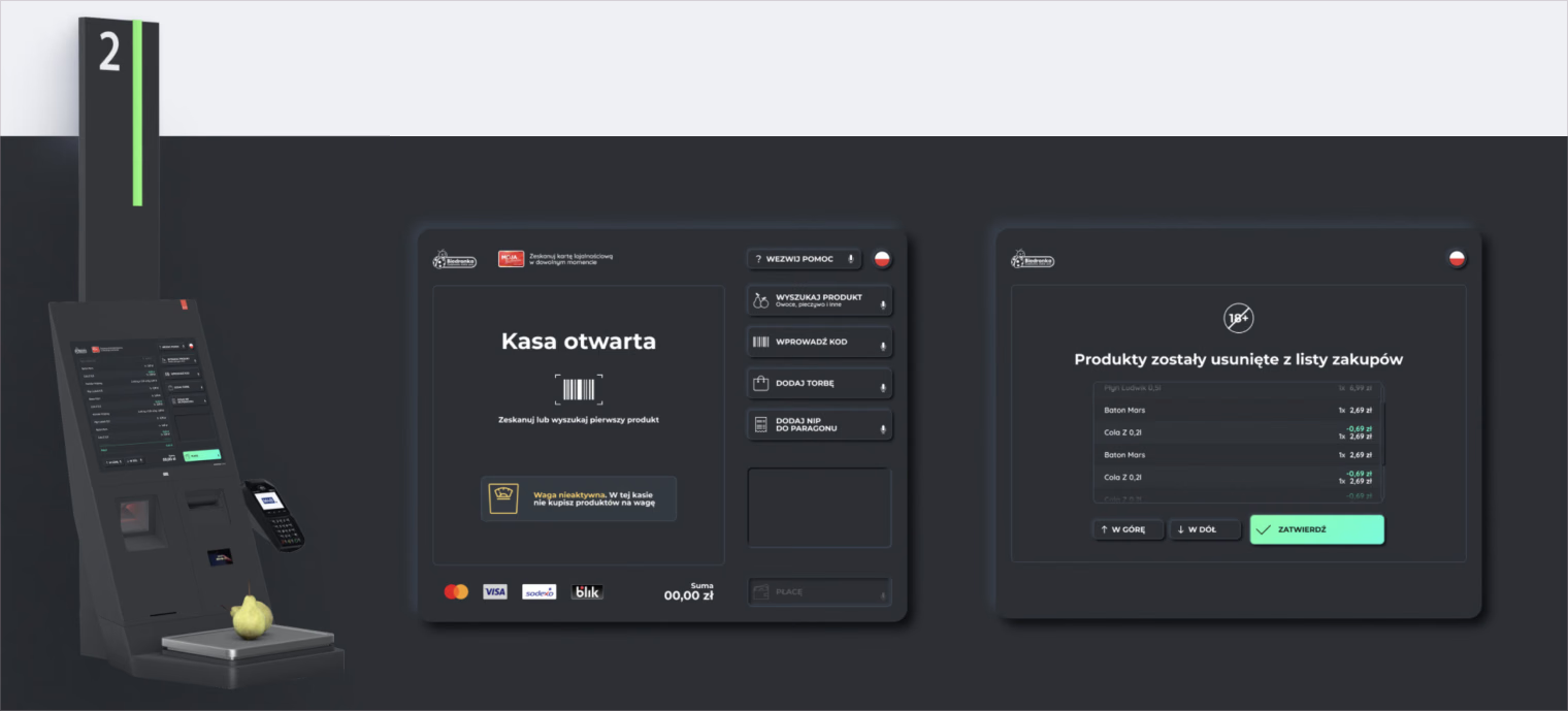
For the final round I ran usability tests with people who often get left out — users with impaired vision, limited motor skills, and wheelchair users. Those sessions validated the contrast and hit-area sizing and the kiosk ergonomics, and drove the last refinements — including deliberately adding a touch of delay to an over-sensitive screen so it stopped misfiring.
Outcomes
Multiple industry accolades and recognition
Trust earned from the company’s end customers confirmed by user research
Expansion of the customer base driven by high-quality user experience differentiation
Designed to cut staff interventions at the kiosk by handling edge cases in the flow itself
M4B Self-checkouts of the Future
Industry
Retail / Self-checkout
My role
Experience Strategist / Design Consultant
Year
2022
About the company
M4B S.A. is a leading provider of innovative digital signage and self-service solutions in Poland, dedicated to enhancing client engagement. They deliver platforms for KFC, Jeronimo Martins, and multiple retail chains.
Challenge
The goal was to design a self-checkout from the ground up, for a market with almost no accessible benchmarks — coupling a physical device with a digital flow that had to feel effortless even for people who aren’t comfortable with technology. Because the hardware constrains everything — sensors, and an update cycle that makes true agile iteration impossible — the experience has to be right from the first release, not patched later. As lead designer I drove it from research through design. Validation was the real story: an early cardboard rig with a taped-on iPad, a bike light standing in for the purchase LED and a webcam faking the camera monitoring — before the harder round of wiring test software into a real machine, fighting genuine hardware and network limits. It’s not a laptop, it’s a checkout.
PHASE 1: Product Discovery
Good practices and benchmarks from self checkouts available in 8 different chains of stores
Expert analysis of selected interfaces. Some of them were unique and inspiring, some showed us what to avoid.
Co-creation involved collaborating with end-users to align on mapping a user journey
PHASE 2: Building & validating a prototype
In the first stages of our prototype, we tested if people noticed that they could operate the device with their voice. We observed their attitudes and willingness to use this feature
While our research indicated that talking self-checkouts cause stress and discomfort, the reactions are opposite when the roles are reversed
We made sure that users remained in full control of the interface. For example: if they don't want to find their grapes by speech, they can use keyboard, Al-driven seproduct scanner or select product from the complete list
Al-recognized products show up in the bottom half of the search engine. You no longer need to remember if an avocado is a fruit or a vegetable!
We made sure that users remained in full control of the interface. For example: if they don't want to find their grapes by speech, they can use keyboard
Al-recognized products show up in the bottom half of the search engine. You no longer need to remember if an avocado is a fruit or a vegetable!
Most kiosks do not provide the option to change the amount of added items. Some hide it in a complex menu and expect users to enter the number before adding the product
We created an intuitive interface with "a premium look" as our research participants suggested. Thanks to the research we performed, it turned out that the new features that are not yet available on the market, are easily understandable by all of our users
PHASE 3: Usability tests on the alpha build and last refinements before deployment
For the final round I ran usability tests with people who often get left out — users with impaired vision, limited motor skills, and wheelchair users. Those sessions validated the contrast and hit-area sizing and the kiosk ergonomics, and drove the last refinements — including deliberately adding a touch of delay to an over-sensitive screen so it stopped misfiring.
Outcomes
Multiple industry accolades and recognition
Trust earned from the company’s end customers confirmed by user research
Expansion of the customer base driven by high-quality user experience differentiation
Designed to cut staff interventions at the kiosk by handling edge cases in the flow itself